A newsletter about branding, startups, and mission-driven companies aiming to make the world a better place.
👋 Welcome to issue #13 of For The Love, I’m so happy to have you all here! And thank you to Retail Brew for including me in this week’s issue!
Today we’ll be discussing:
Cartoon mascots are making a comeback
A roundup of new things that launched this week, including faux lashes...for Zoom I guess?
I have some questions for this glowing humanoid
If you have any curious friends that like learning about new brands and DTC trends, please share For The Love.
⚡ For The Love of Branding
If you grew up watching Saturday morning cartoons, you probably also watched the cartoons inside the cartoons—the ones that sell product.
Tony the Tiger. Cap’n Crunch. Toucan Sam. The list goes on.
Mascots give brands a personality—what was once corn flakes coated in a thick layer of sugar, is now the first step to becoming an all-star hockey-playing tiger. (This example might have been Canada specific. Remind me to ask my husband if tigers play baseball, too.)
At least Tony was aspirational. For the most part, animated characters were just designed to light up the sugar demanding neurons without the unnecessary complexity of a plotline. I mean, can anyone actually tell who’s who between Snap, Crackle, and Pop?
Regardless, these childhood mascots are comforting and nostalgic. Over the summer, the New York Times published an article on the rise of nostalgia:
“According to Florence Saint-Jean, a trauma specialist and the executive director of Global Trauma Research, as a way to cope during times of duress, our brains often take us to places that we subconsciously designate as ‘safe,’ like past memories of a joyful vacation or happy childhood moments that made us feel loved.”
Even before the pandemic, the stresses of modern life pushed people towards products that felt comfortable, and safe—a reminder of simpler times.
That feeling, along with a desire to differentiate from typical DTC branding (more on that here), has led to a resurgence of cartoon mascots.
The cartoon mascot of the modern age is far more sophisticated than it’s earlier counterpart—taking on specific personality traits that manifest in unique ways across the brand and content channels. These mascots still represent the brand’s personality, but they aren’t aimed at the fleeting attention of a child.
These brands are speaking to adults, not that our attention spans are any better.
Don’t Drink the Kool-Aid
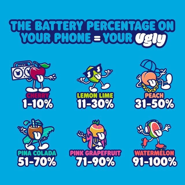
Ugly Drinks, a line of flavored water, lures customers away from sugary beverages with cartoon mascots in an about-face from our past experiences in that aisle. (Remember aisles?)
As co-founder Hugh Thomas told me about the Ugly mascots:
“They can say things and do things that humans can’t…We wanted to deliver a serious message in a fun way—almost like smuggling the message in.”
These include how harmful the beverage industry has traditionally been with promises of refreshment and boundless energy, while really just pushing massive amounts of sugar. They also donate a portion of proceeds to Girl Up (tackling gender inequality) and Oceanic Global (battling pollution).
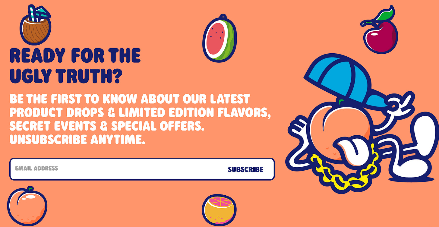
Their signature tongue (which doubles as a “U” in their logo), not to mention the name Ugly, balances a subversive attitude and a lighthearted, playful outlook. Their branding features a range of bold colors—embodying each flavor, personality, and mascot.
As their brand grows, so does their roster of mascots. According to Hugh, they’re “a mix of different backgrounds, genders, ages, cultures,” reflective of one of the key tenets of the brand—accessibility. It’s affordably priced at $1.50/can and sold at a number of major grocery chains, as well as online, so you don’t have to be “in the know” to discover it.
Silly Rabbit! These Aren’t for Kids.
OffLimits, a line of “functional cereal,” is also using cartoon mascots (and a dose of nostalgia) to attract a decidedly adult audience. One flavor turns your milk into cold brew—not exactly kid-friendly. That’s Dash, with, what else, but a rabbit mascot in a business suit. (Perhaps in sweats at the moment, though…) Zombie, a “chill-inducing adaptogen” infused cereal, features an undead mascot (duh) and a post-mortal companion feline.
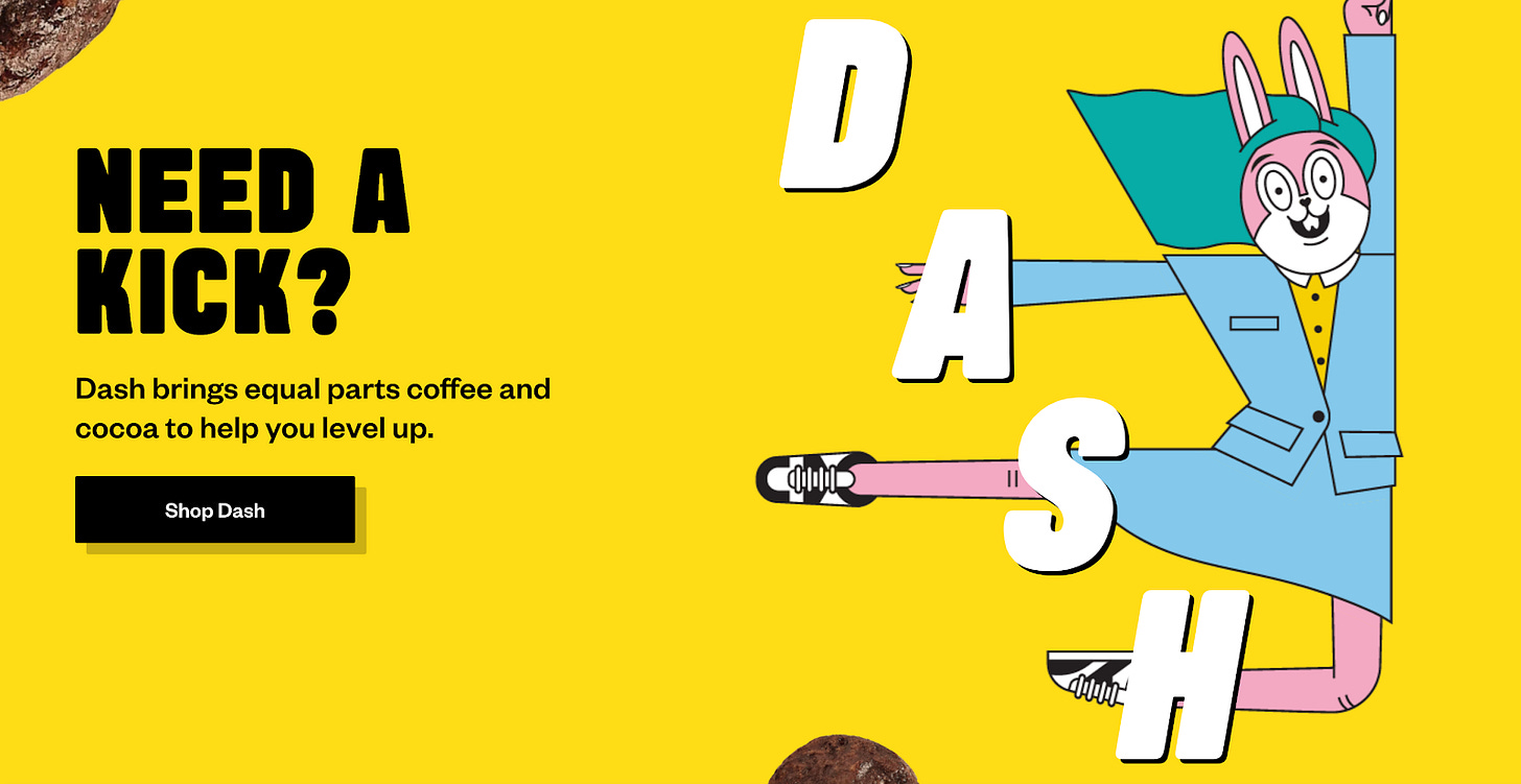
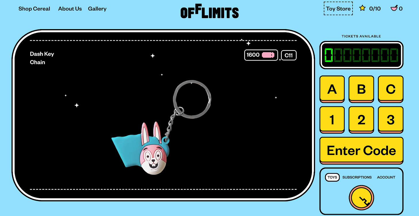
Their branding and website are visual playgrounds featuring suspended spinning cereal and zombie hand cursors. From a vibrant-meets-sophisticated palette to comic-book style fonts and layouts, it has all the elements of a childhood cereal but oh so grown up. Like Ugly, their mascots are designed to represent all types of people—they embody relatable states of mind.
As Michelle Lora, OffLimits’ COO, explained to me:
“When modernizing cereal, you can't help but think of iconic cartoons like Tony the Tiger and Cap'n Crunch. After digging into them we felt like those cartoons were used to lure in children. We wanted to bring back cartoons, but in a way that people can actually relate to.”
Plus, toys!
“When anyone who grew up in the '90s thinks about cereal, they immediately wonder WTF happened to the toys? It's definitely an homage to nostalgia with a hint of modern-day streetwear...If you're in it for the toy, then you can choose what you want. If you're just here for the cereal, then you can opt out to avoid it ending up in a landfill.”
OffLimits is also using cartoons to raise awareness around a more serious topic. According to Michelle, “OffLimits puts creative abilities and mental wellness as top priority in everything we do. I believe Art is a therapeutic outlet, innate in everyone.” Their site features an art gallery (and in-person pop-ups when doing things like that are allowed), and a portion of proceeds go to Wide Rainbow, a non-profit that serves low-income neighborhoods with limited or no access to the arts or arts education.
It’s Tequila (or Disaster) Time.
While cartoon mascots can represent a wide range of people (as with Ugly Drinks and OffLimits), they can also project a very specific message or attitude.
Take Volley (tequila) and Judy (disaster kits). Both were branded by Red Antler, and use charming hand drawn characters as core elements of their brands.
In Volley’s case, a sugar-free canned tequila seltzer, they have Spike, a “fun-loving, attention-seeking mascot...Spike loves sun hats, afternoon hikes, and short ingredient lists.” Just look at his satisfied smile and wide-brimmed hat, and you’re transported to a beach where you can sip your well-executed cocktail without a care in the world. We all aspire to be Spike.
Meet Spike.
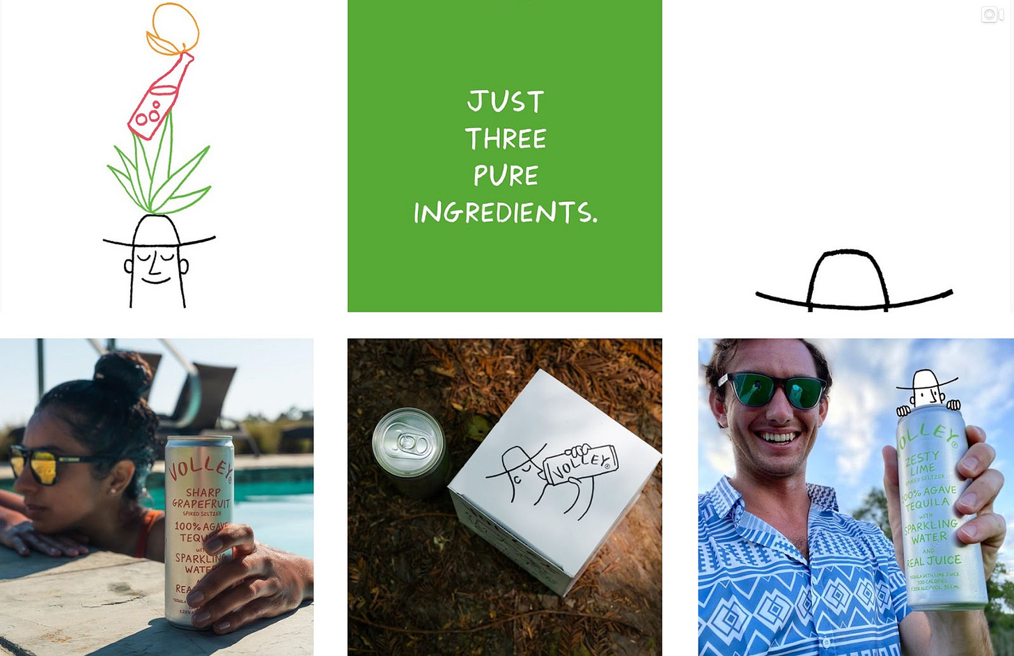
Volley takes Corona’s (the beer, not the virus) message one step further—it puts a face to the attitude. And with custom fonts and vibrant colors (each representing the natural-flavor in the corresponding drink), it is far more sophisticated.
Where Volley’s mascot is the embodiment of your stress-free headspace, Judy’s mascots are working non-stop to take away your stress. They also have hats. And sometimes whistles.
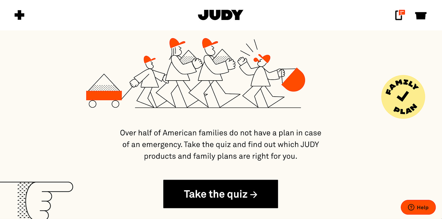
Judy makes disaster kits. Their website ominously states “over half of American families do not have a plan in case of an emergency.” But paired with happy little workers assembling your disaster preparedness kit? Much less anxiety-inducing.
This is accompanied by a bright orange tone—attention-grabbing, like red, but not as alarming. From Red Antler’s website:
“Our brand system, from the name and illustration style to the iconography and organizational design, works to transform emergency preparation from an intimidating task to a point of pride and reassurance.”
Both brands’ mascots are nostalgic in their simplicity. Volley’s has a hand-drawn line quality and the haphazard look of a spontaneous sketch—a far cry from today’s almost too perfect digital renderings. And the same goes for Judy’s simplistic geometric characters and their rudimentary tools in solid blocks of orange.
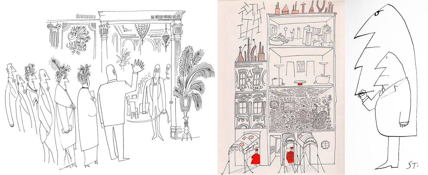
They are also reminiscent of Saul Steinberg’s work, whose drawings became popular in the late 1940s. His illustrations had, according to Artnet, “a playful, childlike-doodle quality while also maintaining an elegant deftness.” Sounds like the perfect style for something that’s equal parts nostalgic, and sophisticated.
A cartoon mascot can be incredibly effective in giving a brand a personality and a narrative that customers can relate to. Paired with a dose of nostalgia, this can forge a powerful connection with your customers. According to Michael Solomon, professor of marketing at Saint Joseph's University, nostalgia is effective because it creates a sense of belonging: "One of the main motivations for shopping is to recreate or create a sense of community... It's all about feeling that you have a connection.”
“When I make a good image, it enters into your brain like a word you didn’t know and stays there in such a way that you can’t remember how you thought about this topic beforehand.”—Saul Steinberg
🔥 For The Love of Newness
Speaking of mascots, Uncle Bens got a much-needed rebrand.
And Smuckers got a rebrand that no one wanted.
Jenna Lyons, J. Crew’s former creative director launched…checks notes...a line of false eyelashes.
Summersault expanded to “Activewear for Everywhere.”
Public Goods (purveyor of pretty much all your basics needs) now has your pet’s needs covered too.
🔍 For The Love of the Details
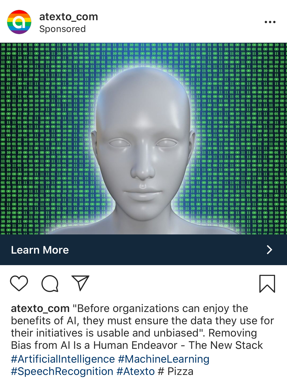
I have… questions. All of them.
What does this company do?! Maybe this glowing humanoid can tell us?
The only two people I know without pupils are this person and Little Orphan Annie. Is it possible Daddy Warbucks is now some kind of AI supervillian?
#Pizza??
Thank you for being part of For The Love!
A few more things...
Is there a topic you think I should cover? Or a funny ad I can dissect? I’d love to hear from you! You can email me at info@ajasinger.com, respond to this email, or drop it in the comments ⬇
Know someone who’d enjoy this newsletter?
Was this newsletter forwarded to you?
Written by Aja Singer, a brand and creative strategy consultant interested in all things startup, mission-driven, and community. Born in Canada. Based in Brooklyn. You can also find me on Instagram and Twitter.


