👋 Welcome to issue #1 of For The Love, a newsletter covering branding, startups, and mission-driven companies aiming to make the world a better place.
What better way to kick off a newsletter about mission-driven brands than branding lessons from the OG social-impact brand, Ben & Jerry’s. Let’s dive in...
✌ For The Love of Doing Good
Since their launch in 1978, Ben & Jerry’s has been committed to making the best ice cream from the best ingredients and improving the world along the way. This mission is made even more impactful with skillful branding to support it. Here are a few things we can learn:
Wear Your Values On Your Sleeve (Or Pint).
Ben & Jerry’s values are plastered everywhere. Their commitment to natural ingredients is front-and-center on their pints in the form of heaps of cherries, and chunks of chocolate. And their social media feeds are full of causes ranging from Black Lives Matter to rainforest preservation.
Your mission should be visible everywhere, not just a blurb on your website.
Differentiate or Die.
If you’ve ever stepped foot in a grocery store you know there’s no shortage of ice cream options in the freezer aisle, but Ben & Jerry’s pints are easy to spot. In a sea of artisanal brands packaged in subtle shades and elegant fonts, Ben & Jerry’s vibrant multi-color packaging and bold graphics (their signature font is called Chunk Rethunk, lol) are hard to miss, not to mention instantly recognizable. In a fully-packed freezer aisle, attention-grabbing is what you need.
Your brand doesn’t live in a vacuum — think about where it lives, how it’s being seen, and what it’s competing with. Differentiators (from colors to container shapes) will get you noticed and get you market share.
Branding is a Marathon, Not a Sprint.
Ben & Jerry’s core branding is tightly edited — shades of blue, green, and yellow (nature-influenced colors to reflect natural ingredients and their commitment to the environment) and, of course, their signature playful font. Once that foundation is set, it can be built on. This comes in very handy given their MANY brand partnerships and co-branded products. This means a pint featuring Stephen Colbert, or a Netflix-centric web banner is still recognizably Ben & Jerry’s.
Start with clearly defined, recognizable branding, so as your business evolves, your branding can adapt *and* stay consistent.
Speak Up.
Whether you're reading Ben & Jerry’s web copy, tweets, or packaging, it’s always accessible and friendly (it is ice cream after all), and reflects their brand values. It’s also distinctly theirs — who else would name something Chip Happens? Or Empower Mint?
Use your brand voice in inventive ways — it can communicate your personality (think industry-expert vs. trusted friend), what you stand for, and engage customers in a dialogue, building brand equity.
"The bond that you create with a consumer based on shared values is the deepest bond that you can possibly form" — Ben Cohen
💣 For The Love of Newness
The post-work (from home) apéritif trend continues, and this time it’s non-alcoholic. The newly launched Ghia features nervines — herbs that soothe the mind.
Brandless is re-launching — First up they’re selling product bundles packed into…suitcases (?!).
Heinz got a makeover.
Modern Fertility released pregnancy and ovulation tests.
Calibrate, a new approach to weight-loss (think metabolic health over willpower), launched an app.
🔥 For The Love of the Details

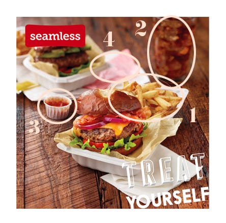
What is going on here?
Before we break this down, let’s keep in mind this is an ad for Seamless — a delivery service. So where on earth is this taking place? I’m just speculating here, but I don’t think anyone has a ketchup dispenser and tiny paper cups in their home...
1. Who dumps their fries into their burger container? Seriously, I’m asking. Has anyone ever done this? If so, I have some questions.
2. Soda in a glass — on its own, not confusing at all. But surrounded by what appears to a meal in a fast-casual restaurant, this makes no sense. No plates. No tray. But a glass.
3. Let’s put aside, for a moment, that a little paper cup full of ketchup has no place in an ad for a delivery service. What I take offense to is that it’s the single ugliest way to show ketchup. I am assuming they want this to be an aspirational image. And pumping ketchup into a tiny paper cup is not it.
4. Is this a receipt?! Out of all the inconsistencies here, this where they wanted to keep it real? Yes, let’s put some garbage on the table. *Chef’s kiss*.
That’s it for the first edition — Thank you for being part of For The Love!

A few more things...
Is there a mission-driven brand you think I should cover? Or a funny ad I can dissect? I’d love to hear from you! You can email me at info@ajasinger.com or respond to this email.
Know someone who’d enjoy this newsletter?
Was this newsletter forwarded to you?
Written by Aja Singer, a brand and creative strategy consultant interested in all things startup, mission, and community-minded. Born in Canada. Based in Brooklyn. You can also find me on Instagram and Twitter.


Congrats on the newsletter! This is spot on except, however, I aspire to have a ketchup dispenser with the little paper cups in my home.