A newsletter about branding, startups, and mission-driven companies aiming to make the world a better place.
👋 Welcome to For The Love, so happy to have you all here!
Today we’ll be discussing:
Why illustration is making a comeback
A roundup of new launches from the past few weeks, including an unlikely collab that sold out in an hour
DTC comes to the prepper world
If you were forwarded this by a friend, join DTC brand and marketing leaders by subscribing here!
⚡ For The Love of Branding
In 1918 people celebrating the end of the war and declining influenza numbers showed their excitement with a 3-mile conga line wrapping down Fifth Avenue.
In 2021 we have people celebrating the end of quarantining (and masking) with a 3x wraparound line to Brooklyn’s Union Pool.


The 1920s were a time of excess and celebration. Of course, these sentiments were reflected in the art, and advertising of the time.
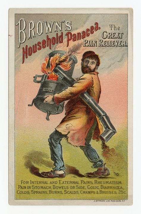
Eye-catching fonts and vivid colors peppered advertising gems for real-life scenarios like this:
We’ve all experienced a trip to the dentist for a cleaning and he says, “There’s room for improvement here.”
“You know what would help? Cigarettes.”
We know now that cigarettes can’t do nearly as much for you as a wood-burning stove, which cures diarrhea, sprains, and, ironically, burns…
At this time stylized illustration was the dominant form of ads, incorporating and setting cultural trends (for better or worse, ahem, cigarettes). Importantly, illustration also lent itself to narrative — using nuanced techniques like perspective and line quality to give a brand it’s own unique personality.
But as time progressed photography became more and more prevalent. Only 15% of ads featured photography in 1920. By 1930 it had increased to 80%.
There are many reasons photography became the chosen medium for ads, not least practicality, and cost, but illustration can be an incredible tool in branding.
If a picture says a thousand words, an illustration says ten thousand.
On top of what’s represented, there’s the extra layer of line quality, perspective, and imagination.
Illustration adds a layer of richness — an identity beyond a signature font and palette.
It can also tell a story very effectively.
You may remember a few months ago I mentioned the launch of a new hibiscus drink brand. Only it’s not just a drink, it’s a whole universe.
Well, Rubyverse.
“The Rubyverse is very literally a universe that is in an alternate dimension and time — potentially in the future, but maybe in the past,” founder Noah Wunsch, told me.
“That is where Ruby the beverage was created. It's hand squeezed by The Gnobomes, and the Shmoo, caretakers of the Ruby flower. And there is a vanquisher of planets in the Rubyverse called Sugar, which goes to different planets and destroys them by essentially infiltrating the beverage system and hiding a lot of sugar content in the beverage until people die. And Ruby is the power source that sugar is trying to kill.”
Even Noah admits, it’s a lot of effort (and context and storyline) for one drink, but it’s worth it. He explained:
“The Rubyverse in the real world is an access point to Ruby, the brand — it opens up different cultural doorways that inspire the brand.”
They enlisted illustrator Sharmila Banerjee to build the Rubyverse.
“Illustrations build the emotional backdrop and story behind the product,” she told me.
“I come from a background of drawing comics, so most of my work is character and story-driven...my approach to illustration is very playful and I like to mix up things regularly.”
On top of effectively building narrative, there’s another huge benefit to incorporating illustration into your brand — differentiation.
“You always have to come up with something new to stand out and in the case of Ruby, the ‘fun factor’ also plays a big role. With an organic and expanding visual backdrop, you keep the consumer excited and the product develops further alongside the visual storytelling.”
Noah agreed:
“I was really interested in figuring out how we might be able to innovate as a brand and create something somewhat new in CPG, where we can create a content platform baked into our brand. In a way that doesn't feel like Ruby is like blasting you with Ruby content, but allows you to create an emotional connection with the brand.”
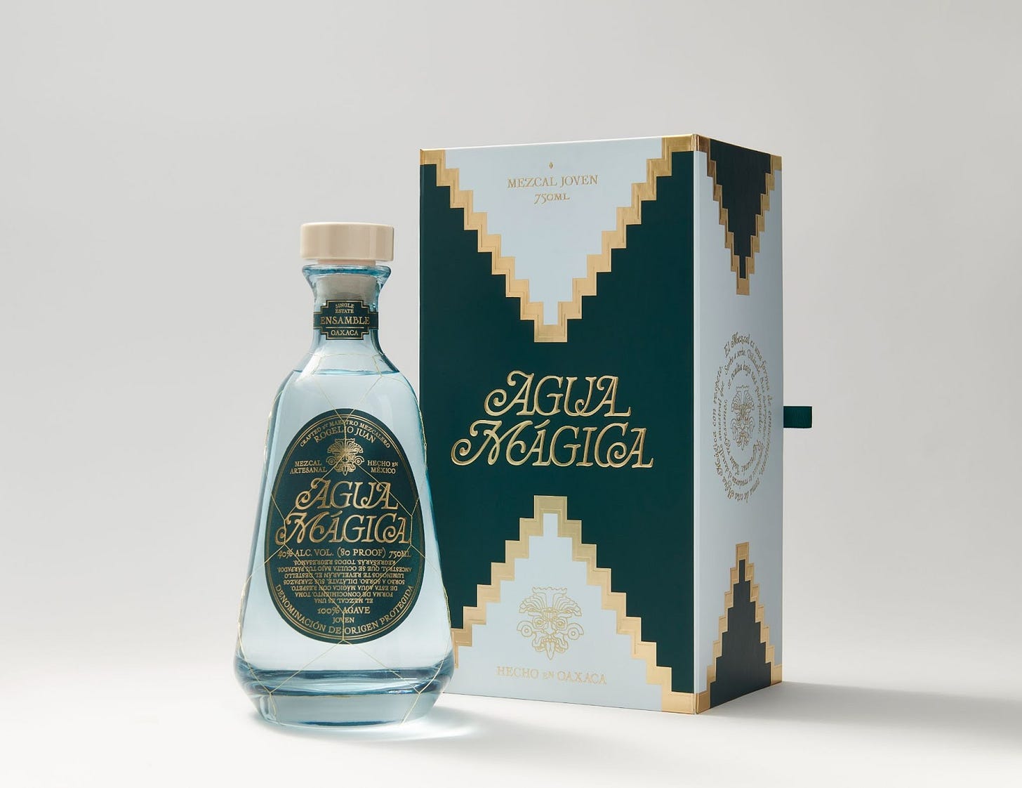
Where Ruby is science fiction set in outer space, Agua Mágica is magical realism, firmly planted in the Agave fields of Oaxaca.
They’re using illustration to draw customers into their brand, and into Oaxacan culture, highlighting the craftsmanship and quality prevalent in the area.
They enlisted artist Miguel Cardenas who was the best at “bringing that tension between modern and authentic and being surreal at the same time,” according to founder Rafael Shin.
“Oaxaca is one of the most colorful places — all sorts of flavors, it's the most maximalist...what we were trying to do with Agua Mágica was to keep that tension between being authentic and being modern,” and they found illustration to be an effective way to do this, most prominently seen in their packaging.
Incorporating gold, blue, and green, representing Oaxacan culture and the agave plant, the packaging is stylized, yet sleek — a first (I can’t help myself)...taste (sorry) of what’s to come.
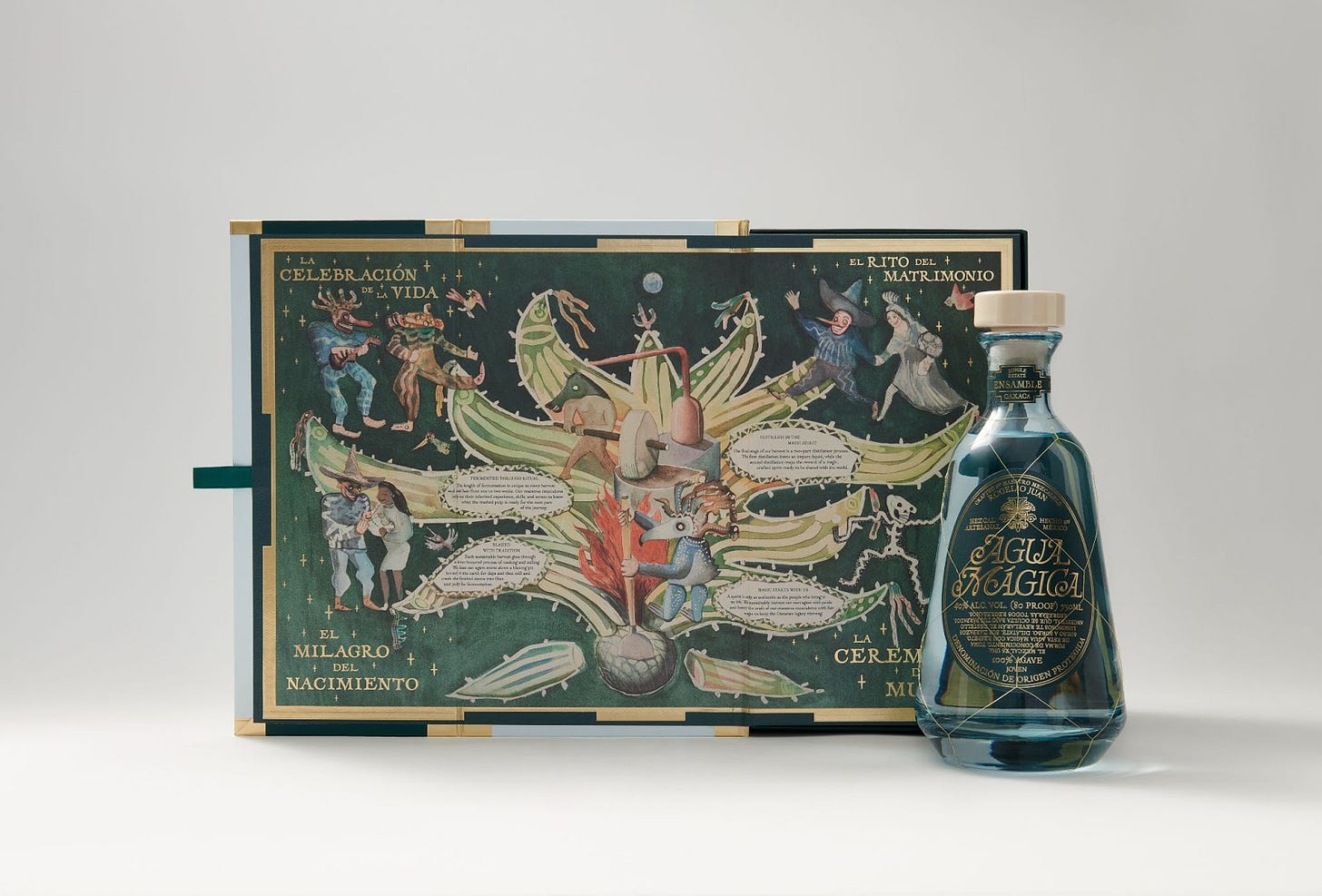
The story unfolds inside the box. As Rafael explained, it “looks clean and modern, but at the same time, when you open the box, you have a completely different experience...everything was basically meant to reflect the beauty of Oaxaca.”
The illustration is meant to “contemporize Mexican lore and prehistoric rituals.”
It’s “a representation of what mezcal means to us. You're going to see two things, one in the middle — that's the production process of mezcal...and around that, you're going to see all the different ways to consume the mezcal. It's all big celebrations — when someone's born, marriage and death.”
Like in the 1920’s they’re using illustration to represent the celebratory mood of the times.
The 1920s were so celebratory, in fact, that apparently F. Scott Fitzgerald described them as “the most expensive orgy in history.”
Hmmm it seems Agua Mágica left that use case off their illustration.
🔥 For The Love of Newness
The collaboration no one asked for but turns out everyone wanted — Kraft Macaroni & Cheese ice cream ℅ Van Leeuwen.
Eatbetter is a low-carb, low-sugar, high-protein. If anyone tries this, let me know — I’m still scarred by my encounter with a gluten-free bagel.
Dukkan is bringing Middle Eastern pantry essentials like Tahini and Za’atar to the DTC market.
Ita is a new line of modern leisure essentials — think beach chairs in Yves Klein blue.
Looking to pair your Netflix and take-out with a low-ABV plum juice forward wine? Night In has you covered.
Ditto is “a little fizz for everyone” aka a sustainable spritz made from upcycled grapes.
If you’d prefer your fizz in tequila form, Happy Hour is here and uses real juice.
Chop Chop is a new line of fresh, frozen noodle cups — yes, you just add water.
Peepal People is making small-batch hot sauce with a Pakistani influence.
The aptly named Know Beauty claims to know your ideal skincare routine with the help of a DNA test.
If you’ve been searching for an *aesthetic* toolkit Yuns is here to help.
Oishii and Brightland collaborated on strawberry vinegar featuring the Omakase Berry (aka the very fancy $5 strawberry).
🔍 For The Love of the Details
The DTC world is a tough business with stiff competition.
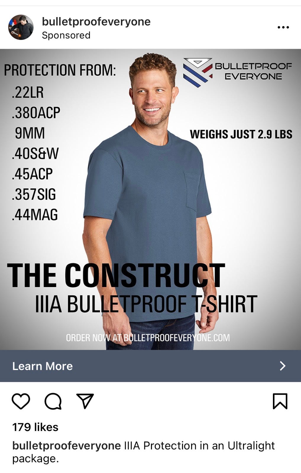
Maybe things are getting a bit too heated when the latest in performance t-shirts is having “bulletproof” as a feature.
Because that’s definitely the problem with body armor — it’s too heavy and it looks like body armor.
Haven’t you asked yourself, instead of reflecting on why someone’s trying to shoot you, “How can I become impervious to bullets while only wearing a t-shirt?”
The problem with this ad is that this model has the confidence of a guy wearing almost three pounds of bulletproof t-shirt, which is a total giveaway. If you’re staring down a bad guy with a gun, and you’ve got this look on your face, the bad guy is going to be like, “Heeeey…You seem pretty calm about all this. You aren’t by any chance wearing one of those bulletproof t-shirts I saw advertised on Instagram, are you? Oh man, you almost had me for a second there. I think I’ll just aim for your totally exposed head, then.”
Thank you for being part of For The Love!
A few more things...
Is there a topic you think I should cover? Or a funny ad I can dissect? I’d love to hear from you! You can email me at info@ajasinger.com, respond to this email, or drop it in the comments ⬇
Know someone who’d enjoy this newsletter?
Was this newsletter forwarded to you?
Written by Aja Singer, a brand and creative strategy consultant interested in all things startup, mission-driven, and community. Born in Canada. Based in Brooklyn. You can also find me on Instagram and Twitter.


